

Logos have a way of evoking emotions, and those emotions can produce a strong sense of connection and brand loyalty in the consumer.
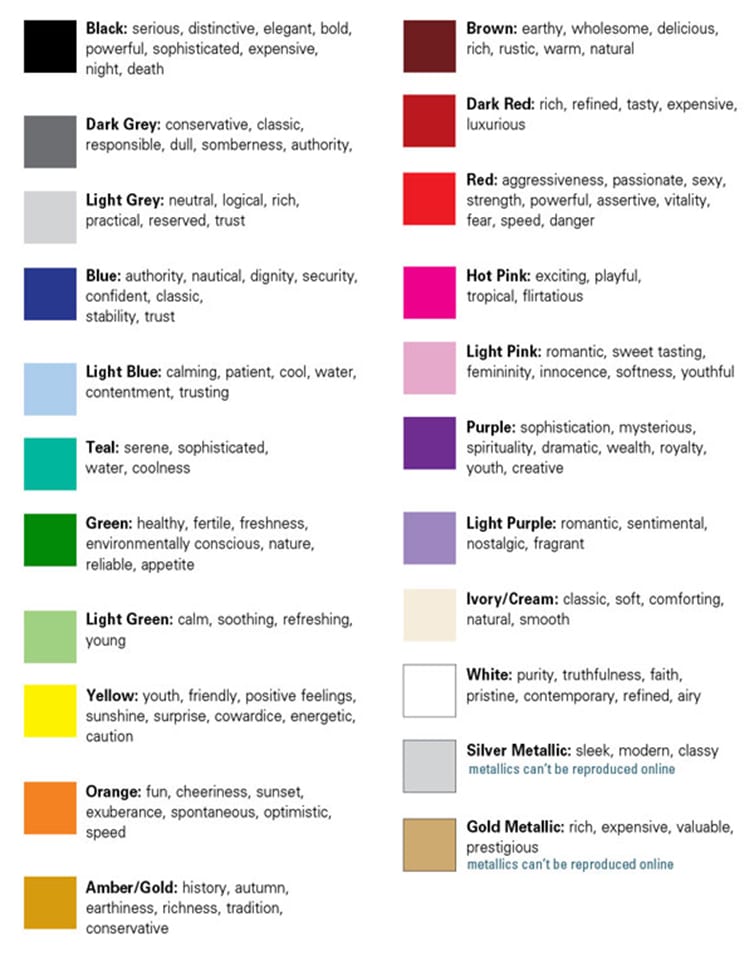
Have you ever noticed the calm and peaceful feeling you get if you walk into a room painted green? Or how yellow can make you a little hyper? (I literally don’t wear yellow shirts because of this.) Color plays a massive role in how a logo is received by consumers, so choosing the right color is as important as the logo design itself. Different colors are linked with different emotions.
Now let’s dig in and find out what colors you should use for your business’ logo!
Primary colors tend to have more intense associations, and many of the world’s most valuable brands utilize a primary color scheme. If you want to stimulate the feelings of passion, trust, or love, consider a logo that is red or mostly red. Blue can evoke comfort, faith, understanding, confidence, and trust. While yellow can be used to express joy, vitality, energy, and newness.
Where does it all start?
Brand recognition starts in childhood. A University of Amsterdam study found that two and three year old children recognize more than half of famous logos without word-marks. This means that even before children even learn to read, they are capable of understanding that certain logos are attached to certain products. The Nike swoosh means a pair of sneakers. The red swirly letters of the Coca-Cola logo mean a delicious, sweet, bubbly brown drink. Apple’s silver apple means screen time or game play. This loyalty is often established in childhood, many times before a child is an active consumer. Choosing a simple, easily recognizable logo design with a purposeful color is essential in maximizing your marketing potential.
How to choose the colors for your startup logo
When selecting a color for your brand, begin to think about what color represents your brand’s personality. Is your company fun, fresh, and edgy? Consider using yellows or oranges in your logo. Next, think about what color suits the characteristics of your products or services. Using yellow – a color associated with happiness, sunshine, and energy – would not be best suited to a funeral home logo. Finally, think about what colors your competitors are using. What vibe are they portraying? It’s important for your business to stand out. Choosing a color that is the opposite of your main competitor can help customers differentiate between you. As you choose your logo color, or colors, don’t forget to think about the functional impact color has on issues like readability, eyestrain, the ability to attract attention, and visibility at night. For instance, an all yellow logo may be hard for your customers to see if you offer products or services to older folks.
Choosing the colors to represent your business can be very tricky. Remember, you will be investing a lot of money in your brand over time. You may have letterhead, marketing materials, building signage, vehicle signage, uniforms and more that use your color pallete prominently. You’ll want to get it right the first time to avoid spending valuable marketing dollars re-branding down the line.
A fantastic logo is worthless if your potential customers can’t comfortably read it or if it blends in to the background. Above all, remember that simplicity is your greatest asset as you design your logo.